
CIBI
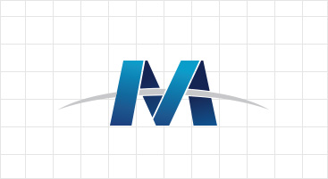
design concept
The "M" logo symbolized Michang Cable.
The logo design describe the leap forward spirit of Michang cable, which continue to grow and advance as a trust company, a creative company and a company that servers the nation and society.
The "M" letter symbolize the effort and race to be reborn, the "spear" across M letter symbolize goal and challenge.
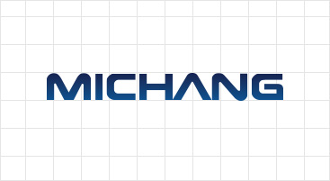
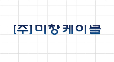
Wordmark
Word mark is designed to indicate the official name of Michang Cable.
The word mark is visually adjusted the balance and proportion considering the unity and combination. The word mark does not allow any change in any situation.
Symbol type
English word type
Korean word type
Color Grid
